Role
UX Designer & Product Designer
Year
2026
Tools
Pen & Paper · Figma · Photoshop
DURATION
Ongoing
The starting point

I live in Verbier.
I noticed something.

Verbier attracts a specific kind of traveller. Someone who books a chalet months in advance and expects every part of the experience to match the altitude.

The chalet: sorted.

The lift pass: sorted.

Dinner at that mountain restaurant everyone's been raving about?


That's where things fall apart.

You hunt down a website, fill out a form, wait for a confirmation that may not arrive. Or you call during peak hours, it rings out, you try again, you give up. And if someone does pick up — they're mid-service, navigating two languages, and your booking might end up on a Tuesday when you clearly said Thursday.

I spent a season living and working here. The gap between the physical experience — which is genuinely world-class — and the digital one was hard to ignore. MaPlace is my attempt to close it.

Verbier attracts a specific kind of traveller. Someone who books a chalet months in advance and expects every part of the experience to match the altitude.

The chalet: sorted.

The lift pass: sorted.

Dinner at that mountain restaurant everyone's been raving about?


That's where things fall apart.


You hunt down a website, fill out a form, wait for a confirmation that may not arrive. Or you call during peak hours, it rings out, you try again, you give up. And if someone does pick up — they're mid-service, navigating two languages, and your booking might end up on a Tuesday when you clearly said Thursday.


I spent a season living and working here. The gap between the physical experience — which is genuinely world-class — and the digital one was hard to ignore. MaPlace is my attempt to close it.

Two sides of the same problem

The restaurant loses money.
The guest loses patience.

The restaurant loses money.
The guest loses patience.

The restaurant loses money.
The guest loses patience.

Guest side

The alpine guest is time-conscious, digitally fluent, and allergic to unnecessary steps.

When the booking experience doesn't match the premium context around it — clunky platforms, unanswered phones, language barriers — they either call and hope for the best, or they just don't bother.

The alpine guest is time-conscious, digitally fluent, and allergic to unnecessary steps.


When the booking experience doesn't match the premium context around it — clunky platforms, unanswered phones, language barriers — they either call and hope for the best, or they just don't bother.

Restaurant side

Mountain restaurants run on compressed seasons and tight margins.


A no-show during peak February is a table that could have been turned twice.


Most still manage reservations by phone, with no deposit and no real recourse — paying someone to handle bookings between service runs.

Problem statement

 "How might we create a reservation experience that's fast and frictionless enough for a premium guest — while building in enough commitment to protect the restaurant from no-shows?"

Before touching Figma

Three decisions
that shaped everything.

Inspire first, ask later

Inspire first, ask later

Early versions looked like a standard restaurant browser — functional and completely soulless. Leading with full-bleed photography changed everything. The goal isn't to show Marcus a list. It's to make him want to be there before he's tapped anything.

Early versions looked like a standard restaurant browser — functional and completely soulless. Leading with full-bleed photography changed everything. The goal isn't to show Marcus a list. It's to make him want to be there before he's tapped anything.

Progressive disclosure

Progressive disclosure

Every screen has one job. Show only what's needed to make the next decision.

Every screen has one job. Show only what's needed to make the next decision.

Commitment without friction

Commitment without friction

A card hold — clearly communicated, never charged upfront — solves the restaurant's no-show problem without making the guest feel penalised before they've even sat down. The copy around it matters as much as the mechanic.

A card hold — clearly communicated, never charged upfront — solves the restaurant's no-show problem without making the guest feel penalised before they've even sat down. The copy around it matters as much as the mechanic.

Who we're designing for

Meet Marcus Sinclair

"If I have to call to book a table,
I'll find somewhere else."

Marcus Sinclair · 38 y/o · London · Management Consultant

In Verbier: long weekends · twice a season

In Verbier:

long weekends · twice a season

Goals

Spend as little time on logistics as possible

Know at a glance if a place is worth his time

Everything confirmed and out of his head before

the gondola opens

Spend as little time on logistics as possible

Know at a glance if a place is worth his time

Everything confirmed and out of his head before

the gondola opens

Frustrations

Platforms that ask too many questions

Having to call during business hours from another timezone

Interfaces not designed for someone wearing ski gloves

Platforms that ask too many questions

Having to call during business hours from another timezone

Interfaces not designed for someone wearing ski gloves

How it came together

From napkin sketch
to native app.

Observation

Observation

Living in Verbier gave me direct access to the problem

Living in Verbier gave me direct access to the problem

Watching guests navigate the booking experience in real time, and understanding the restaurant side from eight years working in professional kitchens. I wasn't guessing at what happens when the phone rings during Friday dinner service. I've been the person picking it up.

Watching guests navigate the booking experience in real time, and understanding the restaurant side from eight years working in professional kitchens. I wasn't guessing at what happens when the phone rings during Friday dinner service. I've been the person picking it up.

Sketching

Sketching

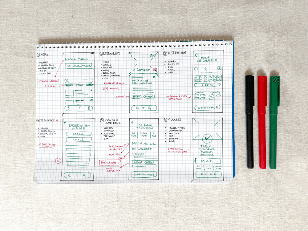
Hand-drawn wireframes first.

Hand-drawn wireframes first.

Getting the flow on paper forced me to think about sequence before aesthetics. The bottom sheet for reservations came from this phase — keeping the restaurant visible while the user books felt more honest than navigating away entirely.

Getting the flow on paper forced me to think about sequence before aesthetics. The bottom sheet for reservations came from this phase — keeping the restaurant visible while the user books felt more honest than navigating away entirely.

Lo-fi

The biggest call here: removing the reservation placeholder from the home screen. It was redundant. The carousel below did the same job better. Less noise, cleaner hierarchy.

Discovery

Home

Restaurant

Prioritized direct search and top-rated venues above the fold to cut down browsing time for high-intent users.

Booking

Reservation

Confirm & Book

Replaced the standard calendar wall with an immediate time-slot selector.


Users see exactly what’s available the moment they land.

Resolution

Success

Kept the confirmation screen strictly functional.


The map and reservation details are front-and-center so the user can take a quick screenshot and move on.

Visual direction

The UI needs to feel as premium as the dining experience it facilitates.

I used a warm parchment background and sparse bronze accents to reflect an alpine, high-end hospitality vibe. Clash Display brings brand personality to the headers, while Outfit guarantees strict, functional legibility for the actual booking data.

I used a warm parchment background and sparse bronze accents to reflect an alpine, high-end hospitality vibe. Clash Display brings brand personality to the headers, while Outfit guarantees strict, functional legibility for the actual booking data.

Warm Parchment

Sparse Bronze

Graphite

Bone

Aa

Clash Display

Aa

Outfit

Aa

Clash Display

Aa

Outfit

The Solution: Less Friction, More Fondue.
The Solution:
Less Friction, More Fondue.

Six screens.
One clear journey.

01 — Home

01 — Home

Creates desire before asking for action.


Restaurants are emotional decisions.


The interface leads with atmosphere instead of search, using photography and subtle social proof to create intent before the user has to choose anything.


Creates desire before asking for action.


Restaurants are emotional decisions.


The interface leads with atmosphere instead of search, using photography and subtle social proof to create intent before the user has to choose anything.


Creates desire before

asking for action.


Restaurants are emotional decisions.

The interface leads with atmosphere instead of search, using photography and subtle social proof to create intent before the user has to choose anything

02 — Restaurant

02 — Restaurant

Everything needed to say yes.


Only the information that influences the booking decision appears before secondary content.


Rating, availability, amenities and location are surfaced first so uncertainty is reduced before the user commits.

Everything needed to say yes.


Only the information that influences the booking decision appears before secondary content.


Rating, availability, amenities and location are surfaced first so uncertainty is reduced before the user commits.

Everything needed to say yes.


Only the information that influences the booking decision appears before secondary content.

Rating, availability, amenities and location are surfaced first so uncertainty is reduced before the user commits.

03 — Reservation

03 — Reservation

The restaurant never disappears.


A bottom sheet keeps the destination visible throughout the booking flow, preserving context.


Booking feels like a continuation of the same experience rather than a separate transactional screen.

The restaurant never disappears.


A bottom sheet keeps the destination visible throughout the booking flow, preserving context.


Booking feels like a continuation of the same experience rather than a separate transactional screen.

04 — Confirm and book

04 — Confirm and book

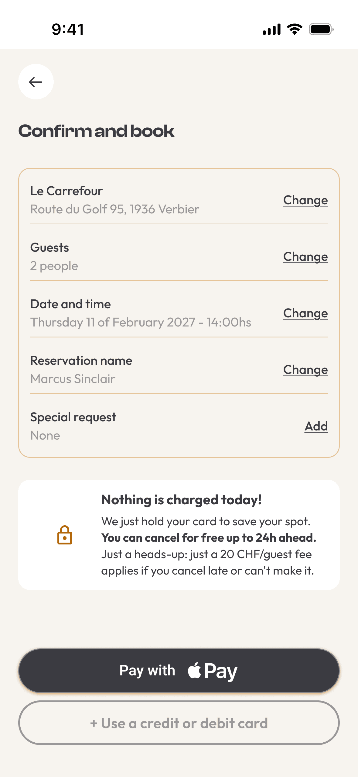
Trust before payment.


“Nothing is charged today” appears before Apple Pay to reduce uncertainty.


The goal is to frame the card hold as a guarantee for the restaurant, not a penalty for the guest.

Trust before payment.


“Nothing is charged today” appears before Apple Pay to reduce uncertainty.


The goal is to frame the card hold as a guarantee for the restaurant, not a penalty for the guest.

05 — Success

05 — Success

The booking becomes anticipation.


A second photo at dusk shifts the emotional tone from transaction to anticipation.

A second photo at dusk reinforces what matters now: not the reservation, but the experience waiting ahead.

The booking becomes anticipation.


A second photo at dusk shifts the emotional tone from transaction to anticipation.

A second photo at dusk reinforces what matters now: not the reservation, but the experience waiting ahead.

06 — Home (return)

06 — Home (return)

06 — Home (return)

The app already thinks ahead.


Once dinner is planned, the interface encourages discovering what’s next.


The upcoming reservation stays visible, but the hero moves on to a different restaurant so the app feels more like a local recommendation than a booking log.

The app already thinks ahead.


Once dinner is planned, the interface encourages discovering what’s next.


The upcoming reservation stays visible, but the hero moves on to a different restaurant so the app feels more like a local recommendation than a booking log.

The app already thinks ahead.


Once dinner is planned, the interface encourages discovering what’s next.


The upcoming reservation stays visible, but the hero moves on to a different restaurant so the app feels more like a local recommendation than a booking log.

WATCHING IT WORK

The Flow, Stitched Together

Six static screens tell you what the app does. They don't tell you if it feels right.

So I animated the full booking flow start to finish, in Figma. It was the first time I'd prototyped with real motion instead of flat frames, and it surfaced things the static screens never showed me: a tap that needed more feedback, a transition that felt too slow to trust before I even saw it play.

Nothing here is final polish. It's a working draft of how MaPlace should feel, not just look.

Six static screens tell you what the app does. They don't tell you if it feels right.

So I animated the full booking flow start to finish, in Figma. It was the first time I'd prototyped with real motion instead of flat frames, and it surfaced things the static screens never showed me: a tap that needed more feedback, a transition that felt too slow to trust before I even saw it play.

Nothing here is final polish. It's a working draft of how MaPlace should feel, not just look.

The full reservation flow, from browsing to confirmation — animated in Figma.

The full reservation flow, from browsing to confirmation — animated in Figma.

A few decisions worth explaining

Design Decisions

Why the bottom sheet

Most booking flows cut the visual connection to the place you're booking.

The bottom sheet keeps Le Carrefour literally in the background.

Small decision, meaningful effect on continuity.

Most booking flows cut the visual connection to the place you're booking.

The bottom sheet keeps Le Carrefour literally in the background.

Small decision, meaningful effect on continuity.

Why a card hold, not a deposit

A deposit implies distrust.

A hold — 20 CHF per guest, only triggered on no-show — solves the restaurant's problem without penalising the guest upfront. "Nothing is charged today" took a few iterations to land.

Four words, significant difference.

Why the hero rotates on return

Showing Le Rouge when Marcus comes back signals the app knows his context and is already thinking ahead.

The difference between a platform that logs transactions and one that feels like a local recommendation.

Handling the Unhappy Path

Graceful Cancellations

The Intent
The Reassurance

The Resolution

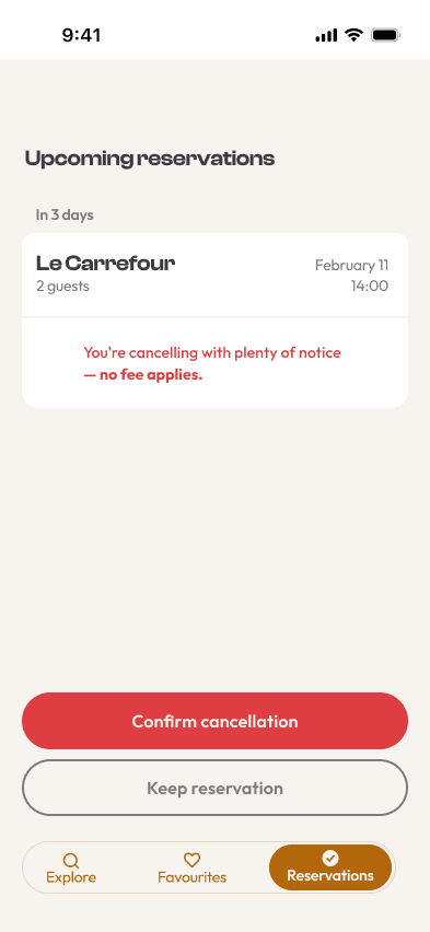
Cancellations are inevitable, but they shouldn't feel like a penalty.

In the hospitality industry, an early cancellation is actually an operational win—it instantly frees up inventory for the floor staff to rebook.

The goal for this flow was to remove any friction, guilt, or hesitation. By placing the reassuring microcopy—"You're cancelling with plenty of notice — no fee applies"—front and center, the interface actively encourages users to release their table the moment their plans change.

It protects the restaurant’s floor plan from empty seats while maintaining absolute trust with the guest.

Cancellations are inevitable, but they shouldn't feel like a penalty.

In the hospitality industry, an early cancellation is actually an operational win—it instantly frees up inventory for the floor staff to rebook.

The goal for this flow was to remove any friction, guilt, or hesitation. By placing the reassuring microcopy—"You're cancelling with plenty of notice — no fee applies"—front and center, the interface actively encourages users to release their table the moment their plans change.

It protects the restaurant’s floor plan from empty seats while maintaining absolute trust with the guest.

One state changes when it's too late

Same screen, same buttons.
Only the copy changes.

Under 24 hours, the fee we mentioned at booking becomes real.

I didn't want to bury it behind a support ticket — if trust is the whole product, hiding this moment would undo everything the previous screen was trying to build.

Same screen, same buttons.
Only the copy changes.

Under 24 hours, the fee we mentioned at booking becomes real.

I didn't want to bury it behind a support ticket — if trust is the whole product, hiding this moment would undo everything the previous screen was trying to build.

ONE MORE THING I FOUND IN THE FIELD

Late Isn't Rude. It's Bad Math.
I wasn't looking for this one. It came up during a chairlift chat with a ski instructor.

He said the same thing happens every week: guests running late for lunch reservations. Not because they don't care — because nobody accounts for how deceptive distance is here. A restaurant that's "10 minutes away" on a flat map can easily be 25 once you add a gondola queue, a boot change, and knee-deep snow.

That's not a guest problem. That's a data problem. And it was sitting right outside the booking flow I'd already built.

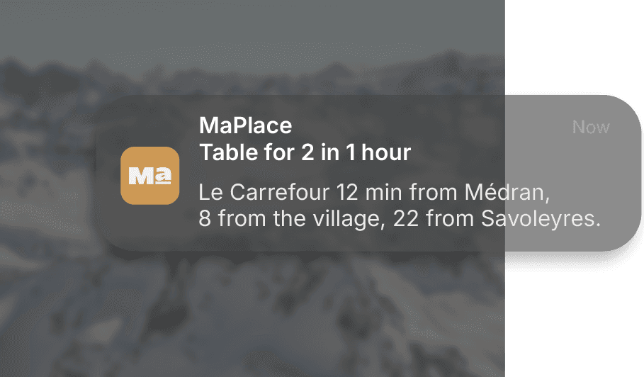
So I designed one more moment: a reminder, sent an hour before the table's held, doing the math the guest never will.

He said the same thing happens every week: guests running late for lunch reservations. Not because they don't care — because nobody accounts for how deceptive distance is here. A restaurant that's "10 minutes away" on a flat map can easily be 25 once you add a gondola queue, a boot change, and knee-deep snow.

That's not a guest problem. That's a data problem. And it was sitting right outside the booking flow I'd already built.

So I designed one more moment: a reminder, sent an hour before the table's held, doing the math the guest never will.

If this were real

How I'd know it worked.

This is a concept, not a shipped product — so there's no real data yet. But if I were validating it, here's exactly what I'd be watching.

Booking completion

Where do people drop off? My bet is the card hold screen — that's the moment trust is tested the most.

Time to confirm

If it takes Marcus longer than 90 seconds, something's wrong. That's the number I'd design against.

No-show rate

The metric that actually matters to the restaurant. This is the real test of whether the card hold works.

Repeat bookings

Completion is one thing. Coming back is another. That's the difference between solving a transaction and building a habit.

What I learned

The hardest part
wasn't the design.

Designing for someone with zero tolerance for friction forces every decision to justify itself. If something wasn't helping Marcus make his next decision, it didn't belong on that screen.

The hardest part was the language around the card hold. A hold that feels like a trap is worse than no hold at all. Four words — "Nothing is charged today" — took longer to find than most of the visual decisions combined.

This started as a portfolio piece. It ended up feeling like something worth actually proposing. The gap is real. The market exists. The technology is straightforward.

I didn't set out to solve a real problem. I ended up doing it anyway.


Designing for someone with zero tolerance for friction forces every decision to justify itself. If something wasn't helping Marcus make his next decision, it didn't belong on that screen.

The hardest part was the language around the card hold. A hold that feels like a trap is worse than no hold at all. Four words — "Nothing is charged today" — took longer to find than most of the visual decisions combined.

This started as a portfolio piece. It ended up feeling like something worth actually proposing. The gap is real. The market exists. The technology is straightforward.

I didn't set out to solve a real problem. I ended up doing it anyway.

AVAILABLE FOR OPPORTUNITIES — 2026

Stop saving this tab for later.
Let’s talk :)

No lengthy forms, no cold proposals.
Just hit reply and tell me what you’re working on.

AVAILABLE FOR OPPORTUNITIES — 2026

Stop saving this tab for later.
Let’s talk :)

No lengthy forms, no cold proposals.
Just hit reply and tell me what you’re working on.

AVAILABLE FOR OPPORTUNITIES — 2026

Stop saving this tab for later.
Let’s talk :)

No lengthy forms, no cold proposals.
Just hit reply and tell me what you’re working on.